This is is part of my live-learning series! I will be updating this post as I continue through my journey. I apologize for any grammatical errors or incoherent thoughts. This is a practice to help me share things that are valuable without falling apart from the pressure of perfection.
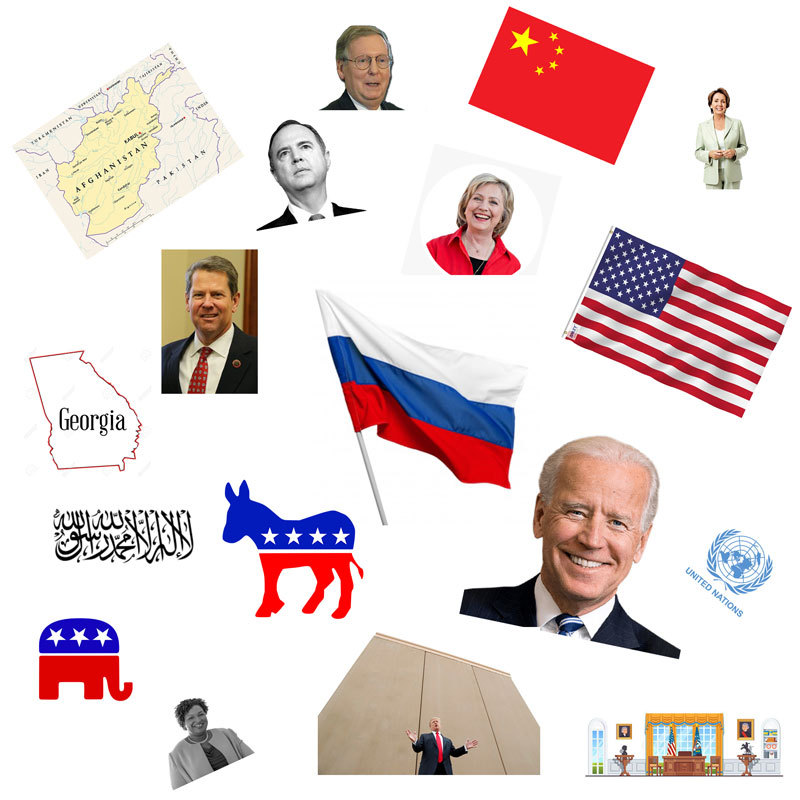
Above, you can see a visual representation of Donald Trump’s Georgia Rally speech on September 25th.
I used our system at Speak Ai to automatically find the entities within the speech and organize them by what was mentioned most.
I then sourced images for those entities. The ones that are mentioned most are the largest and in the middle. The entities that appear less are smaller and positioned towards the outside of the image.
I don’t know, but I am obsessed with visual representations of language. We learn through visuals. We comprehend information so quickly through images, animations and videos. Maybe this image above isn’t data-driven from a bar chart graph display, but it certainly does something to represent the speech that was.
Other Attempts
I’ve done this a few times before. One of them was a get-together a group of friends had online where we recorded and transcribed the video and then ran it through Speak. I pulled out the images and put them into a square image like this. I got such good feedback, I actually generated an animated version of the conversation. You can see the video of that here:
Some people who had been following what we had been doing at Speak Ai told me this was some of the most interesting output they had seen from us. If we can take raw audio files, text, and transcripts and translate them into visual representations automatically, that is a lot of power.
You can transcend languages. You can help people gather a high-level understanding very quickly. You can create something engaging that people will look at, examine, and spend time on. In an internet age where time is a measure of engagement, that is incredibly valuable.
Entities Displayed
If you’re wondering about the image above, the entities displayed are:
Russia (18)
Biden (12)
Democrats (12)
America (8)
Georgia (7)
Brian Kemp (4)
Hillary Clinton (4)
China (3)
Adam Schiff (2)
Taliban (2)
Republicans (2)
Mitch McConnell (1)
The Oval Office (1)
Nancy Pelosi (1)
Stacey Abrams (1)
Manual Process
It’s not perfect. I did this manually. It takes too much time. I’d say 45 minutes. Some entities you can’t find images for. Others you aren’t sure are good enough references or well-known enough to introduce as an image.
This introduces my own bias into the visual representation.
It’s also not mathematically done. Ideally, you can use the number of mentions to generate properly rendered images at the proper size and in the right location.
Aesthetically Pleasing
It’s also not pretty. That’s one thing I find very challenging. I am not a designer by nature. This image-populated version of a word cloud is fascinating but not necessarily beautiful to look at. How can you use frameworks to populate these image-word clouds automatically in a way that is visually appealing?
Another way to come at this would be to display a bar chart with small icon images on top or as part of the label to add a bit more visual representation. This may not be the best practice for data visualization but sharing online it has a significant impact.
Canva
Recently, I’ve been thinking a lot about Canva. They are one of the most valuable private companies in the world. They are being used every day with a passionate customer base. They recently raised $200 million at a $40 billion valuation. Software is eating the world.
What they have done is made it easy for anyone to generate beautiful graphics. Repeatedly. On all platforms. For visual representations of language to be successful, it needs to use the Canva-model to quickly and automatically generate graphics that you want to share!
Clean Data
Along with that comes the need for clean data. It is hard to analyze and visualize information properly when the data is not clean. This is pretty easy for text information, but once you get into speech and transcripts, the level of difficulty turns up significantly.
If you work with automated transcriptions, you know what I mean. Even professional human transcribers struggle with accuracy. Data cleaning is an important part of the process I’ve spent a long time on. In the end, all we want is good data that can help us create compelling analyses and hopefully, visuals.
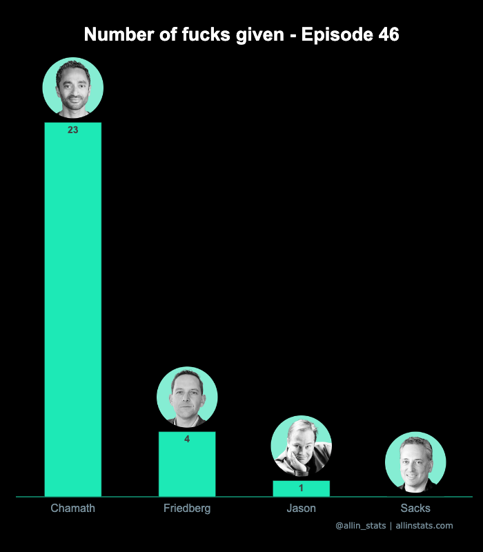
All In Stats
I really love the way All In Stats is presenting their visuals:
The data visualizations Kay Singh and Keerat Singh still have a humble following but their process and outputs can be scaled and create value for a lot of speeches, media and bodies of text. Thank you for your contribution to this work!
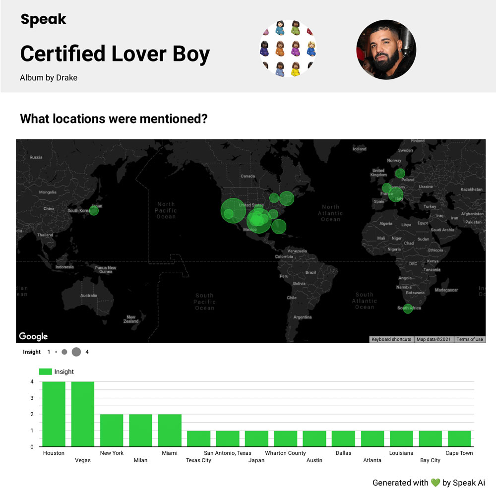
Drake’s Certified Lover Boy Album Analysis
I’ve had other ways of trying to tackle this myself. I recently did an analysis of Drake’s Certified Lover Boy album. Here’s an image of the locations that were mentioned most across the album:
The map adds a nice visual touch but you also need the graph below with the labels to fully understand the data. There is a delicate balance between visual representations and losing meaning.
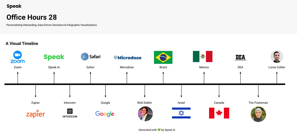
Timeline Representation
Another way I approached this in simple MVP form was a timeline. This adds the time series representation to the graphic which especially in a speech, is an important part of the information.
Here is an example of that from an Office Hours we did as a team at Speak Ai:
This is also not perfect. Timestamps would be helpful to know when an entity or topic emerges. You also can’t really capture how many times that entity was mentioned you can only understand when it first emerged. Otherwise, this would get very cluttered.
Interactive Web Display
I believe there is another opportunity to take any conversation we want and turn it into interactive web pages populated into a visual display and/or timeline. If you click on one of the images, it will jump you to that moment in the speech.
It may seem silly and unnecessary but I believe it will be interesting and there are people who would enjoy those experiences a lot.
Innovating Together
Again, I don’t know why I am so obsessed with this. I just am. Language and communication is beautiful, complex, and the reason we are here today. I think trying to push the envelope on how we capture, analyze, and display language information is a worthwhile endeavour. If you’re reading this, I hope you think so too.
If you have any ideas on generating visual representations of language, please feel encouraged to reach out. I’ve been surprised at how infantile this space is. Generally, we only present word clouds, bar graphs, quotes, and clips to represent language and generate compelling insights. I believe there is a lot more possible. Let’s figure out what that may look like together!
Thanks so much for checking this out. I’ll be back to improve this content for you.
Interested in Tumblr and WordPress Selling Data To Midjourney and OpenAI? Check out the latest video and resources from Tyler Bryden on Tumblr and WordPress Selling Data To Midjourney and OpenAI!
Interested in Mistral Releases New AI Model Mistral Large & Partners With Microsoft? Check out the latest video and resources from Tyler Bryden on Mistral Releases New AI Model Mistral Large & Partners With Microsoft!
Tyler Bryden
February 26, 2024
Don't want to chat but want to keep updated?
I'd love if you subscribed today. I promise I will only send you great, valuable content that has transformed me and helped others flourish.