
Episode Summary
– Prototyping content creation workflow
– Prioritizing Twitter response to popular trending topics
– How to best toggle back and forth between Tyler Bryden and Speak Ai
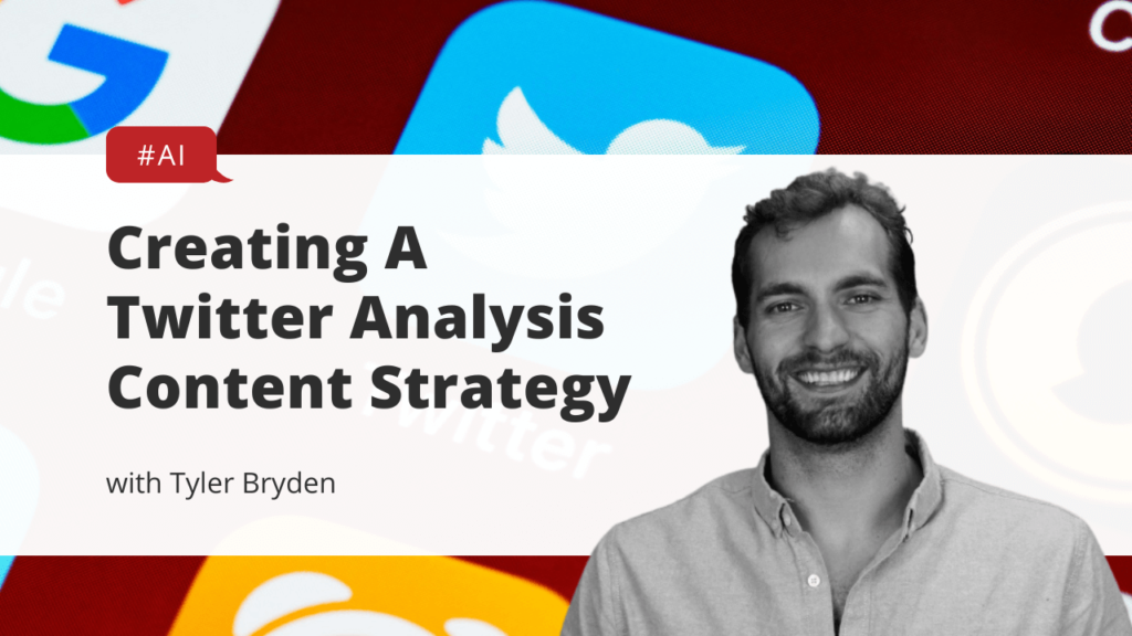
– Example analysis with an “Inflation Reduction Act” Twitter scrape
– Understanding what people want to know about trending topics
Hashtags
#twitter #twitteranalysis #sentimentanalysis #nlp #namedentityrecognition #twitterdata #tweetanaylsis #contentcreation #languageanalysis #naturallanguageprocessing #datavisualization #ngrams #ai #ml
Resources
No-code audio & video transcription software | Easy AI analysis | Speak Ai
Speak Ai Twitter Analysis Data – Google Sheets
‘inflation reduction act’ EN visual keyword research & content ideas : AnswerThePublic
Google Trends
Tyler Bryden – YouTube
YouTube Video
Automated Transcription
Alright hello, hello Tyler Bryden here hope everything’s going well as always and many of you know I am the owner of a company a company called Speak AI. I’m gonna share my screen here quicker. You can see it pop up here. Turn your language data into insights. Fast software platform that has been built have a lot of love for this. Has spent much time on this in my life and it’s the culmination of a lot of things that I I care about. Language, data visualization, analytics. Human communication all these wonderful things. And so this is a, you know, a fairly steady software platform that has been refined over three years now and continue to build upon it and move from. At one point a very personal sort of almost like analysis application to now as we work with more companies, seeing that bloom into a place where people want to take large datasets. Sometimes as we recently shared Twitter, Twitter data.
Amazon reviews that podcast entire categories and. Dump that into the system and help find sort of patterns and themes sentiment throughout it. And really, there’s a lot of capabilities. If you take these large unstructured datasets, plug them into a system like this, and then what we’ve gone on to do has been put it into you, know what we hope to continue to be is a relatively intuitive software interface that allows technical and non-technical people to interact with this data. So I’m not going to bore you with all those details because I’ve done.
There’s many videos. Check out PKI, the YouTube channel. Check out the website, lot of fascinating stuff on there and just sign up for the app itself and but one of the things that we’ve been trying to think through as just a small team here is how can we create content on an ongoing basis and with a relatively new capability to scrape Twitter. Just as an example, in a relatively refined way, plug that data into speak and then. Run our sort of auto analysis on it and then refine that overtime. I think there’s a really good opportunity to create content on an ongoing basis, so today I’m going to sort of run through a little bit of, you know, sort of. I guess a prototype or a concept workflow here for how I’m going to do this. Talk about some of the things, and this is sort of a self discovery for me as I’m going through this and how I would share this and and do it for the first time.
To figure out what’s working, what’s not, and then you know we’d love to hear from you. If you are watching this video, do you find this interesting? Is there is this valuable? If you have requests for sort of. Trending topics or things, or conversations or things that are happening, or events that you would like to capture. Some of the conversation on specifically looking through the lens of Twitter at this moment, but also possibly looking at popular YouTube videos where there’s actual video where we analyzed the video. But then there’s the comments which have a wonderful insight to them as well too. So basically looking at these other different areas where there’s popular sort of peaking topics or content where speak has the power to analyze that content and then.
Produced some sort of ideally rich insight from it, or at least something interesting, and then I’ll walk through that sort of on the fly in the video, and generally I’ve been doing this relatively recently, just breaking. Maybe, you know, just as an example there was, you know, the Y Combinator. This video is done fairly well, even though I talked to quiet. Why Combinator announced they were decreasing their cohort size? What I’m doing in that video is finding a bunch of articles, some links, maybe some interesting.
Messages or posts on it, and then you know doing some of my own reflection. Adding my own perspective into it. And then you know what I’m hoping to do a little bit more to just supplement that is a little bit of analysis of the response to that, and that’s something that I think is missing now and then. I’ll pop up a Reddit forum or maybe a tweet thread, but generally that’s not that hasn’t been as big a part of it, and I think that adds a little bit more of a data-driven approach to this as well. It just bakes in speak something that you know works so hard on for so long.
You into the process and then sort of shows the value I learned from it. We refine the actual system itself and then people see the opportunities and even why we’ve built this tool. Why we’ve built the software. Why do we actually think this is valuable? Why do we spend our time on this? So like a couple of things that I’m thinking about, they’re really with the goal to have ongoing sort of content creation possible, and one of the things that I’ve always sort of started with and have showed this on a couple of videos that I’ve done is like what is something that’s trending. And when you see these you can see.
In some cases there are, you know, a huge spike in the amount of searches that is happening, and generally what’s nice is. We’ve got sort of the main topic there, but then we’ve got a headline that goes along for it and I’m going to walk through a little bit of a Google doc of you know what I’m thinking here, so one of the things that I’m trying to think of is, for example, if this is, you know, the title. Let me see if there’s a good one here. OK, I mean, let’s go of course Tyler. Come on, I like a lot of healing. Went on, Aaron Rodgers said Iowaska helped. And then, you know, that’s not even the full title. I could probably sort of shorten that down. And then what? I’m trying to think of is what do I print at the end of it? So I’ve got a little piece here. I’m going to talk about it, but what I’m trying to think of is sort of this idea. So, OK, I go to Google trends, or I find something generally that I’m just interested in, and then I’m sort of putting the story in the trend plus the actual.
Twitter analysis or some version of this, and you know this is giving you a little bit of insight into how I’m going through research process and then that content creation process and workflow. So being very transparent in this effort to help improve it, maybe get some ideas and just walk through this. For you to then see hopefully what becomes a valuable outcome in the end, which is good content here. And so you know looking at this, which is also these ideas of like. So story Trend Plus Twitter analysis. But then there’s also this idea of trend analysis or trend research, Trend Report, Twitter report, Twitter research. So there are some different sort of variations of this. What I hope to do is sort of based on search volume. Maybe the competition on it. Find one of these that is the right one and then sort of keep that consistent throughout so it would be the story plus the actual analysis of it. Now one of the things that you know just to have a little bit of concerns about is like a lot of these stories sometimes.
Trending our political story so. One of the questions I’m asking myself is am I doing this through toddler bread YouTube channel which continuing to grow? Or am I doing it through the speaker? I YouTube which I will pull up and add as a resource here for myself and for you. If you are interested, of course, which has you know.
33 subscribers, we’ve got 90 videos. Bunch of different sort of walkthroughs and tutorials, et cetera, et cetera. Some which have done well, some which have not done well. And then a lot of our office hour videos where we’ve sort of filmed conversations as we’ve been building out the product, which are actually somewhat insightful and quite interesting if I do say so myself and and So what I have is this ability to. Look in and so I would look at a Google trend. I would say you know, maybe I, maybe I should continue. OK, I get it Norton, let’s just say just say say take the search term Aaron Rodgers. And then I actually do a query into the engine. I can’t quite show you that yet, but it will be actually built into speak at some point.
And then I pull that in. I query I can specify the time range I can specify. The locations that I want, the languages that I want, although we can do multi language translation. With speak the way that we built this system and then I can scrape generally 500 tweets at a time and 500 is both a lot and also not that much compared to what would be the volume of tweets that take that time. And So what I’m, you know what I’m trying to think of or what I’m balancing or some of the things I’m considering is, like you know, is 500 tweets enough? What is the date range that I’m looking at? Because as an example we talked about this story. The story has continued.
There was the source of sort of original story which was maybe last week, and now we’ve seen continuation of this stories, which is now the NFL sort of saying, hey. They are not going to punish Aaron Rodgers for this use, so you know, in this case, do I need to stack NFL and Aaron Rodgers together or do I look at the changes over time of the tweets to pull some insight, not just on, you know, say a certain day but say over the last week. Has this peaked in popularity? Has the sentiment changed, etcetera etcetera? So that’s one of the things that I’m sort of considering throughout this.
Wrote this piece is like what you know. What is the best way to present this data? How can I do this in a better way? And there are. Some some really positives to this, like one of the things that’s really exciting is and I’ll share this actually just so you can see the data itself is like Twitter.
Is quite capable of, you know, generating a lot of valuable information. So I have this which was a story that really sort of peaked in popularity yesterday, which was the Inflation Reduction Act, but continues to be talked about and will continue to be discussed as this sort of bill goes live. And I’ve got all this data that is sort of coming out of it, and that goes all the way from, you know the query. But then the tweet creation date, and then we’ve translated that just in case it’s in a different language, we’ve actually removed cleaned that sort of tweet. You know, clean as as it possibly can be. You can see the original tweet actually has some tags and everything there. We’ve removed removed those tags and then we’ve actually separated them and we can see you know who did they. What hashtags were used, who did they? Did they tag? Did they tag anyone in those? I think that’s actually a different call in there, but you can basically see who they tagged in it. The URLs that there we go, tweet URLs, who did they reply to and then.
Even stats on the actual tweets itself, so a fantastic a huge nice range of data there and then what I love to see is that there is also in in many cases, so I think this what with this one query, which was the inflation reduction app that pulled up almost 500 tweets specifically on August 8th, which sort of honed me in on this specific sort of time period that this was peaking and then in that I’ve got quite a few people who are actually, you know, had their locations identified, so then that opens up. A lot of analysis potential and the part that you know working through here now, which is sort of on the Pro is one of the cons is that we need to sort of split this data and we have speak which is here which I will do a brief look at here right now and then. We’ve also got this data studio here, so both of these are pulling in. These are pulling in this data and then analyzing it in a different way. So I have this data also combined into a CSV compatible speak import which we’ve sort of automatically produced with the same thing where you can see the name, description, text, which is the text that created that date of that tweet, and then we’ve got a couple tags so we know the query inflation reduction act, and then we know it’s a tweet and if there was a country associated with it then we also have the US in this example as part of it. So fantastic I can then.
Filter I can say you know I want tweet, but then I also want the tag to be like us and then I could filter type this in US. And sorry I’m still working through some of this. I can say only care about the US data in this regard. So now it’s filtered out compared to ones that are not. Now I’m actually lying when I say that because I’ve got to tweet tag, so I would actually need to just do the US. This is one of the blockers that we have right now. Is that this is a.
This is an ore condition, so it’s tweet or what we need to do is actually do this as a tweet and so a little bit of better filtering. It needs to happen on our side to make this more valuable. And then we’ve got a couple notes. Let me pop this up for a second. Make sure I’m popping this in the right place of like how we want to improve.
You’ll improve sort of the visualization or the analysis of this data, and I mean at a core level, it’s already quite valuable you’ve got. You can say we’re interested in a specific search term. We can search directly into that. We can organize this into a folder if we wanted to better do that. We’ve got some other tags that we could do in this case. If I have multiple tweets, but I’m looking for a specific query, I can just do that query so it would be the inflation.
Reduction right? So then I’ve only got that data as part of it, and then I would apply the filter. I don’t need to do that because we only got one of these in here right now and then more than that, what we’re always trying to do is produce sort of like automatic insights or themes or patterns that are emerging beyond just like sort of what you can sort of process as a human where you would be manually tagging this, like in a more qualitative research manual method, more traditional method you would be going through this and manually tagging it. What we’re trying to do is use the power of NLP, specifically named entity recognition, and then some sentiment analysis to automatically sort of identify those themes. And so for this case obviously makes sense. Inflation was a huge one, and that’s because it was in every search term. But then we can also see Democrats here. So I’ve got Democrats. I’ve got Republican, I’ve got mansion, who’s a Democratic politician and a couple of other things that are starting to surface, and then generally with size you are getting a representation of.
How many times that that was actually apparent, and so I can then click let’s go. I’m interested in. Let’s check out Republicans. And now we’ve got out of the five near 500 tweets. We’ve got twenty of those that mention specifically Republican and then Republicans can now run.
So I’m drilling down and. And then starting to see some patterns about what it is. And this was another risk that I was always sort of hesitant to Republican, something about Hunter Biden’s penis. So this is another thing of like between Tyler Bridge and speaking. How do I want to do this? Because you know, generally you know there could be some things where I don’t know exactly what’s going to pop up on querying the Internet. And the Internet never loses in some ways and might have some ridiculous things. Or maybe some hateful things. Maybe some violent things.
Or, you know, at the very least some possibly biased things or misinformation. So what we can see here very quickly start to see some of the talk specifically around Republicans. And then it looks like that one’s not working at the moment, so let me go back to the main piece here so I can automatically then filter and sort by sentiment. The other part that I’m trying to figure out, and it’s actually an interesting insight, especially as we sort of look at sort of bots and everything online is that this is someone who is. Tweeting so the high noon under score USA.
And this person. This is not a duplicate because they’ve actually tweeted at different times. And So what I’m what we’re also trying to figure out through here is like I saw another one that was repeated over and over again, and so, like, how can you handle duplicates that maybe aren’t necessarily duplicates, so here it was. Today you voted. So I’ve got 64 of those. Now that’s getting duplicated.
A bit because I’m not looking in a specific column, but you can see that that is basically So what are these? Are these bots? What is this? And then how does that skew then? The analysis that’s in here? The sentiment that’s in here? If these are all negative sentiments, well, the overall sentiment in this chart is going to be, you know, misrepresented or or biased. And so this is where people talk about for sort of analysis of large datasets you really need to make sure that you have clean data, and in this case, Twitter.
While we’ve done a lot to clean, it is actually a very difficult source to do it, but then it also has the benefits of the other metadata, the geolocation and all this other stuff, and then the ability to filter and say hey I only want original tweets and I don’t want retweets and so you can start to narrow down and specify, or you can even go as deep as say hey I only want verified people so you know people actually have the verification check on Twitter I only want their tweets so you could start to look at maybe more influencers or thought leaders in this compared to anyone. You can tweet and then maybe you’ll get a different result. And if I go back to sentiment, I’ve got. You know I can start to filter even more. I can start to see more I can jump to these specific moments. I do think that there is more that we can do here. One thing for example. The face you can see you can hover over it and see the actual score. Basically what this very sad face is showing is basically very negative and then if I filter the opposite you can see very happy. So it’s basically one 2 – 1 and then in the middle you start to see a little bit more.
Have a neutral or slightly smiling face that’s actually happening, so we should be able to filter a little bit more by sentiment and say I only want to look at neutral as an example, or I only want to look at sentiment in this range. The other piece is because there is this variance in score from one to minus one. We should be able to have you know very positive versus positive versus slightly positive neutral, slightly negative, negative, very negative. Additionally, there’s some pretty easy opportunities for us here to add more of an emotion analysis. Fire on it, so it’s more of this. It’s a happy disgust, anger, etcetera, etcetera and so you start to add another layer. Sort of rich information that then you can start to break out these tweets by group them and identify. And then we’ve also got some things where you know.
We all these tweets are pulled from August 7th. It’s like this tweet here you like this chart here is pretty messy. Just because there’s so many tweets and doesn’t necessarily show us that much and it’s the date it’s the date plus the actual time frame itself, but it’s not necessarily giving you that much information and so the other question we’re asking is like how can we? How can we improve sort of the charts and visualizations? At one point we hope that you can customize it yourself. I can also drop down. I can narrow and say I only want to see 25 or I only want to see the top ten and so then it starts to get.
A little more interesting and haven’t even gone to the point that I can say, you know, let’s go instead of looking at all. I actually want to only look at brands and so I can apply that filter. It’s not gonna get everyone right, but you can start to see Mega Medicare or GOP. You can start to see which brands were mentioned most. And in this case Senate then appear. So now, like some really interesting insights are starting to come out. I can dive into this and we can like start to click on Senate see OK? What were people talking about? The Senate?
I was appalled that the Senate and so you know again, I could spend a lot of time on this on what I’m trying to figure out is how can I make it interesting? The other pieces like we have this sort of, I would say the word might be crappy, especially because the of the the time frame is so short what we’re looking for is a little bit more of a summary or a scorecard of of the original, say 500 tweets that were queried. Now that I’ve clicked on Senate, what is sample set is that? And then of course, the sentiment should sort properly here. Maybe just something going on and then if I want I can.
Jump to that exact media which opens up in a link and I can read the entire tweet and then I’ve got a couple of sort of categories that are being. Automatically populated, so for example forward-looking statements. Here I can see that I can jump to that specific moment and then if I start to see that there are some interesting insights and apologize if anything weird pops up here now it’s pretty good. You can then start to add your own sort of categorizing keywords and phrases that are specifically interested, so I’ve got ones about earnings calls from a little earnings call prototype I did and I’m interested in understanding. You know, maybe if any of the topics that I ever do are about. Sort of, you know, finance. Are there any earnings calls or as this one was always an interesting one? Or are there any forward-looking statements? So couple of fascinating things there and again you can jump back. I can back sort of save some of the queries that I have.
And then I can go. You know, instead of brands, I want to look at geopolitical regions only, and I can see you know what you know. What places were mentioned, and then sometimes it’s sort of curious like why was Rwanda mentioned in this? It was only mentioned twice. Interesting, I must have been. I just want to see, oh here we go. I was like where’s Rwanda so interesting so like there’s some things that pop up that you might not necessarily think of so why? What was Chinas mention to this? You could care less about China, China and then AMP in India are the largest polluters will not stop. So this was all connected to the reflection. Could possibly be responses and so trying to connect those data sources. But generally some interesting things might pop out that are.
That you might just not think of, and that’s sort of the exploratory journey that I’m going on in this video that I think is fascinating, and I hope to reveal and then sort of make it more concise. And then maybe even continue to improve the visualization. The summarization of this data. You can see that the sentiment now with less files as part of it, because I’ve applied only geopolitical starts to be a little bit more interesting, although I think we need to add some more metadata on the tool tip here to make it more valuable Now what I also mentioned is the status studio, which which is cool about this is that it gives me a little bit of a summary. Of overall, the sort of a data set overview and a number of tweets the user followers to retweet, count, tweet, favorite, count, user country, and then tweet quote counts. How many tweets were actually quoted out of this? And then there’s some fascinating things already so I can separate with data studio because I’m able to use speak and then you know I’m able to generate this data format. Part of it speak, but then also push this raw data into data studio. The goal here is at one point to remove the need for data studio to make this possible directly and speak, but that’s always working and hopefully.
You know we we will pull that data. There were some customers and people who love working with us and I can see the username. I can see the final translated tweet. This one was most likely in English and then I could see. The user followers count how many people follow this account and the amount of favorites and just is something that really what I like about this is sort of this color overlay and I talked about this. You know with facial and our team here which is like it would be nice if in our speak engine that there was a little bit more of a color overlay because there’s no real color representation here and so then we are not really quickly jumping. It’s not jumping out to us and what jumps out to here when I look at these colors is that although Fox News had has 22 million followers, I only got 107 favorites on this tweet.
Uh. And so that’s something that is, you know, interesting to me. I should make sure that this is is actually the right way that I’m looking at it, because I’m wondering. I don’t think this is how many people that Bernie Sanders has favorited their tweets. I think this is this actual tweet itself. How many favorites did it get? And so this one got 4000 compared to Fox News, it’s only got 100 even though you know there’s 10 million less followers. So something’s happening with the Fox News profile here in terms of engagement, which I found really interesting. And then.
You know, as always, we can sort of sort and see in general, what is the most popular and so we’ve got the White House? We’ve got the tweet favorite count being the highest, and this was the White House spot itself. Of course you know there you can see the same thing. Well, you know while we look at user account as the highest Fox News, you know, way higher the actual engagement. The actual favorite was dominated by looks like Democrats. You know, categorizing them.
Maybe not Austin. Who have you have ever you have to respect the other asset name of Bill. With 700 billions of new spending, the Inflation Reduction Act. So lots of people criticizing this as well too. And then you know, as I mentioned, sort of some dangerous era territory of me maybe getting too political with some of these topics that I scraped. Now a couple of other things that are sort of interesting. Here is when you have this data and now we have this geolocation information we can start to hone in and start to do some visualizations or understanding of you know who’s tweeting most. And in general the United States.
Canada very quiet on this issue, at least yet on August 7th and we can start to see certain cities and then the Record Council. How many tweets came from not only the country itself, but the actual specific city, and so we can start to see that populate. Looks like, you know, look fairly accurate. The way that we’ve collected this geolocation data and then port it in some interesting thing there and you know it’s wondering, hey, what’s you know what’s Tokyo saying? And this is where you know a location.
Data like if we standardize columns and speak and we had location data, I want to know what I’m not knowing enough or what’s not available enough is me to click on this and say, hey? What tweet was from Japan? I want to know that and so there’s a I can do that in. In speak, actually I need to know the Japanese country code though, so I wouldn’t need to figure that out. And then we’ve got sort of a better breakdown by country. And then we’ve got breakdown by city of the Record Council just a little bit of another way to view it. Sorry I’m skipping 1 here. Got language breakdown. So English being the dominant not only in terms of the amount of tweets, but then also the amount of users who are following those people tweeting in English.
Tweet quote ground and then I should have added the favorite count here as well too, but that’s a lot of data so I will what I’m also trying to figure out is how can I walk through these slides one by one and create valuable content on these and not overwhelmed with information? I love looking at data, but not everyone does and then this isn’t really adding too much besides that. Now stacking the username with the country, the location, and then the follower count. So one piece there just to get a little bit more and you can see that maybe the country wasn’t located. And then the user location was located, so some of the data is actually missing some. Some of the sort of premium Geo location information that’s possible with Twitter, but then some of their profile or somewhere indicates their user location. That connection be even more specific than the country. And then lastly the hashtag analysis and you know what I could do here is put a country filter on top so I can see by country. But then we’ve got the tweet hashtags that are here and which ones are the most popular.
So you know inflation reduction act, smart news, mother Earth and then the one of the problems here with the formatting is these are like, separated hashtags. So Democratic backed and inflation are all. Different hashtags, but they’re grouped as one, and then there’s only one record count, and so truthfully. If we were to look at this, inflation should be here. And this should actually be a record count of two, and then what’s fascinating is if I go to tweet favorite count.
Wag the dog was only used once, but it was favorited 10 times, so that’s actually the most favorited tweet out of it all. Was wag, wag the dog and so that’s like sort of a brief overview of a little data studio I’ve put together to populate information on this, and you know, I think in there just reviewing it sort of interesting myself. I think I need to get better at providing insights or sort of adding another layer of analysis on there, and I’m wondering, do I do that blind? Do I do prep? In between that you know what other things do I need to do to make that more valuable more engaging for you, and more insightful so it’s worthwhile content? And that’s obviously what I’m trying to create here now. A couple other things, and almost 30 minutes here, so if anyone stocks through this, I appreciate it very much, but.
You know, obviously looking at improving speed to make this even more insightful, trying to remove the need for data studio, although I love the program. And then you know I’ve got a couple of things that are sort of pros and cons. Like you know, tweet Twitter is obviously a valuable data source, but there’s problems with bots. There’s problems with the data, you know. People are skeptical of it right now and there’s lots of things going on in the tech industry. So there’s you know pros and cons to this. The other question that I’m trying to you know, think about here is sort of like what do people want to know about a trending topic? And I showed my friend that’s all this, which I’ll pull up. But like and I broke it down. I didn’t even realize I was doing out of time, but.
And why, what, where, how who, so? When did it start trending? Why did it start trending so they original story? And then what’s fascinating here is I’ve got the original URLs so tweet URLs just as an example, I think this is actually going to take me where it’s just going to take me. Sorry if it takes me somewhere weird.
I don’t know if this takes me to the original tweet or the URL that was contained in the tweet. Either way, it looks like it’s loading very slowly, so let’s try another one just to see if it’s redirecting a little quicker. It doesn’t appear to be, but you know those could be resources. Just as an example of the links that people are doing. But then how do you vet those resources? Another thing that I’m trying to think about, what are the most popular and then what do you want to know? Most popular? What has the most retweets, the most likes, the most favorites? What is the response to the story? I think that’s in general are overall understanding of what we want to get. Is that negative?
Positive is, you know where is the trend. Most popular. Obviously location can add some really interesting things. We’ve done some things with age and gender analysis too, so maybe we can even bring that layer into these. How many tweets, positive or negative? And then who is tweeting the most? Who tweeted first about this etcetera etcetera? So lots of things that are coming in there. The other piece that stuck out to me and if I’ve shared this a couple of times in videos is like here is the answer to the public and it sort of asked, you know, sort of separates this data into different questions. Specifically, I typed in inflation reduction.
And then now you’re seeing different formats of this information, or how people are so inflation. You know. It’s not always good like versus, but for example versus inflation reduction act versus build back better. How can inflation be reduced? So what is, yeah, so some really interesting pieces that are sort of coming throughout all of this. Again with the idea.
And there’s constantly trends that are emerging constantly. Things that are there’s too much information for someone to understand. And how can we help provide that guidance? How can we provide insights, help provide that understanding? I know when I look to a resource I think of. For example, the all-in-one podcast I’m thinking of, like they’re helping me with meaning making. They’re helping me with understanding, and I think that’s a very important part of, you know, your role as a person. Or you know what, especially what we’re doing with the software.
Here I’d speak and so you know working out. How can I do this speak versus Tyler Briden? The goal where do I place these videos? In the end? What is the call to action? One of them is, you know, connect with us. Let us know what trends you want us to analyze, and if there’s enough volume, and it seems worthwhile, we’d love to do it. Obviously like comment. Share, subscribe. Sign up with speak. Connect with me. Connect with our team here, here, with the goal to build a little bit of the community here in Raleigh, us around some of this sort of, you know, trend analysis and pop topic analysis and just handling the overall.
You know exponential increase of data every day and it might not. Again might not always be Twitter, it’s just it’s a nice rich form of data that we have the capacity to bring it to speak very quickly. It might be YouTube, might be YouTube comments, might be Reddit forums, might be Cora, whatever it is, something valuable that’s trending that we’d love to break down, and we’ve seen. Even if we took in a video, transcribe it or done this, or what I’ve seen from Tyler Braden, is that when I do this on an ongoing basis, and if I actually create valuable content around it, that there is an opportunity to. Benefit from that through search engine rankings through traffic through discovery and that’s something we obviously want to replicate. I personally want to replicate for Tyler, Brian, but obviously for speak I want that to make it more valuable and to build a community around that and then people to see and understand how this system works. Why is it valuable? What can we learn? And maybe that gives them gives you your own ideas of what you can do. So I am at 30 minutes more than 30 minutes. I hope you have enjoyed this. I know this was sort of a prototype. This was something for myself to work through. Something I can share with my team here to see what they think.
I’m going to post this one specific on Tyler Bride because it’s a bit raw, but you may see videos coming out on this PC. I YouTube channel. I’ve linked that in the comments where I do this on a daily breakdown as well as continue the own videos that I do. Maybe have a flavor of this in there if I think it’s worthwhile. Really, what I would love to know is you’re here. If you’re watching this and you made it this far, you’re a wonderful person. What would you like to see? What do you think would be most valuable? What do you want to know about trending topics? All of that’s really helpful as we sort of build this prototype together. So thank you so much for.
Tune into this. It’s been Tyler Braden. Hope you have a wonderful rest of your day. Like. Comment, subscribe, hit those algorithms, whatever you wanna do. I love you. Hope you have a good rest of day. I’ll see you soon. Bye bye.